Sarah B's Portfolio: Visual Communications

Monday, December 13, 2010

Final Project

  When we brainstormed ideas we had come up with three different ideas, a chart rating projects and terminology throughout the semester, a storyboard, and a tag cloud.  After mapping out iterations of the projects we agreed that the tag cloud would best represent and fulfill the project requirements.  The tag cloud was the best way we could represent the information we wanted to include in the project.

 (Our Inspiration)

In order to begin the tag cloud we had to figure out which terms, concepts, and projects we wanted to include.  We chose the words based on what we understood as the most beneficial, useful, and informative during the semester.  Color and size differentiate the importance and grouping of each word.  For example, dark green represents maps, maroon represents definitions, blue represents overall concepts, and lime green represents graphs.  Each word was designed with a specific purpose behind it.  For example, we agreed that Gestalt is one of the most important terms from the semester; therefore its size is the largest in the tag cloud.  Additionally, each word is written in all capitals not only to make it visually appealing to the audience, but no to discriminate against any letters. 

Once we made each word, we figured out appropriate placement.  We used a coat hanger as the base of our construction.  Two words were attached to the top of the coat hanger.  Since our placement was already resolved it seemed like it would be easy to attach each word according to the plan.  We used a hole puncher and string to connect the words, but in theory the plan was easier than in practice.  Not every word fits exactly perfectly within each space.  Some of the paper is curled because of where each hole meets on each word.  While the tag cloud is not constructed to absolute perfection, our message is conveyed in a successful manner.  Covering the coat hanger is a picture of a cloud with the words “tag cloud.”  Included in the cloud image is a key which describes our color coded system.  We are very happy with the outcome of the project, despite the minor speed bumps to get here.

(Final Project) 

Persona:
-Emily
-Senior in High School, 17 years old
-Athlete, involved in school newspaper
-Interested in small, liberal arts college
-Enrolled in high school communication class
-Visual Learner
-Interested in communications

Personal Reflection:
The most difficult part of this project seemed to be agreeing on good, solid project idea.  Since the project is very open ended we had trouble narrowing down our thoughts to one idea.  I am very glad with how the project turned out though. 

One of the challenges during the project was the tedious assembly of the tag cloud. In theory the assembly does not seem difficult but it was difficult to attach longer words to shorter words.  The most important thing I learned during this project was planning and communicating are essential.  Without proper communication a project cannot be done and without proper planning a project cannot be made.

Tuesday, December 7, 2010

Multivariate Graph

I was slightly frustrated when I started this project.  I had decided what three variables I wanted to use in my graphs but I could not graph my information the way I wanted to in excel.  I tried various combinations within the table I had created but it was not graphing properly.  I made the decision to hand write my graphs after struggling in excel for quite some time.  I knew that if I graphed my information directly in my sketchbook I had a better chance of conveying my message.

The topic I chose to highlight was my quiz grades during Visual Communications.  The X axis is the grade of each quiz measured in percent.  The Y axis is the time spent on each quiz in minutes.  It was easy to remember how much time I had spent on each quiz.  There were not too many quizzes where I forgot.


The second graph I did was in correlation to the first graph because the X axis variable [from the first graph] was the Y axis variable in the second.  So, the Y axis was the quiz grade and the X axis was the week number.  The relationship I wanted to show was, the more time I spent on a quiz, the higher my grade was.  It should be expected that as the weeks continue my quiz grades did as well.  Usually my grades improve throughout the semester because I learn how the teacher teaches and become familiar with the style of the class.  These quizzes were different though.  Through my graphs it is clear that the week number had no bearing on how well I did, but the amount of time spent on each quiz did.  Since I had the internet and books at my disposal, I always used them for the quizzes.  The one exception to this is when I got a 40% on a quiz in week 9.  I had a lot of work that week and thought it would be a good idea to try a quiz without my tools.  It clearly was not beneficial.


I had a lot of trouble understanding this project initially.  I did not know what exactly I was supposed to do, but I do think I created an effective multivariate graph (at least I hope I did!).

Monday, November 29, 2010

Storyboard

I began this project by looking at the pictures we were required to use.  I wanted to first see if I could make a story in my head before choosing a picture and realizing I had no idea what to write about.


I did the project a little backwards, I chose to do the storyboard using two of the required pictures first.  I chose the 4 boys in green t-shirts playing a sport and the profile shot of the man in a blue hat.  Since I chose the picture with the boys playing a sport [at least that is how I interpreted that picture] I wanted to sport to be soccer, not for any particular reason though.  I re-printed a storyboard sheet so four slides appeared on one piece of paper and used a ruler to draw black lines underneath for the narration.  The first box is a drawing I did of a boy getting a soccer ball kicked into him.  I used the 4 boys lined up next.  My narration displays my storyline.  The third box is the man in the blue hat who I made the father of the boy who got kicked with the soccer ball.  The fourth box shows the crowd of sympathetic parents at the soccer game. 


The picture I chose to use for the other storyboard was the four men walking in what seems to be a windstorm.  For this story I did first person narration.  The second box is a close-up of one of the men in the windstorm who does not have a mask to cover his mouth.  The third box is a close-up of all the men.  The last box is another close-up on a different man.  This story was harder to create since I had to draw 3 pictures instead of 2.  In order for the story to make sense I really concentrated on making the people consistent throughout each box.  I hope the audience is able to distinguish each person.


Not only did I have fun making up stories for pictures, I also learned that consistency and attention to detail are very important in both text and visual books.  I am pleased with how my stories came out because I think are slightly humorous and illustrated to the best of my ability.

Tuesday, November 16, 2010

Simple Table and Graphs

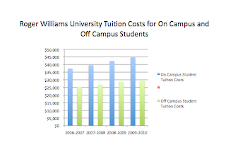
I had trouble beginning this assignment because it was difficult to find information about Roger Williams University.  I tried three different search engines before I came across the information I was looking for.  I chose to have to 3 variables: tuition cost of living on campus, tuition cost of living off campus, and the cost.

I created my table in excel.  I am not very familiar with excel, but I know enough to make a table and be able to graph it.  
  
The table itself is very simple, but I was not able to gather a lot of data.  The information only dates back until 2006.  Once my table was complete I made multiple graphs in order to determine which graph best displayed the information.  Each graph was constructed in excel, and then a title was given in PowerPoint.  I copied each graph into a PowerPoint document in order to adjust the size, add a title, and view the graph without the gridded lines excel has.

Sideways Bar Graph

Bar Graph
Line Graph

Pie Chart


3-dimensional Bar Graph

The two graphs that work the best are the Bar Graph and the 3-dimensional Bar Graph.  All the variables are the proper x and y axis and the graphs are easy for the audience to read and understand.  I'm happy I did this information because I live off campus and it was interesting to do a topic that pertained to my real life.

Tuesday, November 9, 2010

Flow Chart

I was slightly confused by this assignment in the beginning.  I had to carefully plan out my flow chart before designing the actual flow chart.

The first flow chart I did was "ordering the book off amazon."  I began by going to amazon.com and walked through the steps of ordering a book off amazon.  This was very helpful because each step I went through on the website I wrote down on my rough draft what the order is.  My flowchart has multiple decisions/questions in a row.  I am not necessarily sure if that is the right thing to do in a flowchart, but I did not know any other way to organize the steps.  The final product turned out very well.  I was thorough and careful because I did not want to miss any important steps.  My flowchart is easy to read and would help anyone who does not know how to order a book off amazon.
 

The second flowchart was about "researching cognitive load on google."  Again, I went through actual process and wrote down the steps on my rough draft.  This flowchart was shorter than the first one because there were not as many steps involved in this flowchart.  Since this flowchart was shorter I felt that it looked more organized.  The first flowchart had so many steps in it that it looked slightly messy.  This flowchart is not only well researched but aesthetically appealing too.  I was able to make the words larger and be less concerned about the limited space on the page.

Sunday, November 7, 2010

Visual Essay

I had trouble starting this project.  I did not know what graphic to improve because I associated a graphic with a picture.  It was not until I read the suggestions on the Visual Communication web page that I had direction.  I chose to improve a graphic from  Car and Driver magazine, a magazine which I have never read before.  The magazine primarily consists of graphs and charts which compare and contrast different types of vehicles.  I chose a graphic which does just that.


I re-designed my graphic in Adobe InDesign.  I have background knowledge about the program from an electronic communication class I took.  The tools I used within the program were basic though.  I wanted to graphic to be easier to read.  I am not familiar with cars and therefore wanted to make others who do not understand cars able to read a chart comparing various cars more user friendly.

The basic format of he graphic remained the same, I re-ordered some titles in order to clarify certain information, but the information I learned in class about color, size, placement, and typeface were my main areas of focus.  Small, subtle changes make can make a wordy and confusing graphic much easier to read. 

(Original)

The original graphic has odd color usage and inconsistent fonts.

(Rough Drafts)

(Improved Graphic)
Although this project proved to be more challenging than I originally thought it would be, I am very happy with how it turned out.  My graphic is easier to read and more organized.

Monday, November 1, 2010

"How-To" Spaghetti Dinner

I approached this project the same way I did for the in class assignment, "How-To" make a Peanut butter and Jelly sandwich.  I wanted to keep all of my graphics simple so the audience would not be confused.

I first began by breaking the page into four separate sections.  The top line consists of a barilla box of spaghetti and a can of red spaghetti sauce.  The next image, which appears on the same line, is a pot on top of a stove that is filled with water.  Looking back, I wish that I had added one more step in between these.  I should have shown a graphic displaying water being poured into the pot. 


The second lone consists of spaghetti being poured into the pot.  Again, I wish that I had added another step.  I wish that I had somehow figured out how display that the water must come to a boil before spaghetti is poured into the pot.  Next to the pot with spaghetti being poured into it is a clock.  The image next to the pot is of the spaghetti cooking in the pot.  Again, a clock is next to the pot.  The clock reads seven minutes later than the clock to the left of it.  A spaghetti box instructions include a seven minute cooking time.


The third line is the cooked pot of spaghetti being poured into a strainer in a sink.  The next graphic is the spaghetti in the strainer being poured onto a plate.


The final line is an image is the can of sauce being poured onto the spaghetti.  The final image is the plate if spaghetti with sauce on it, a fork and knife, and a glass of wine.


While this project seemed simple at first, it is not easy.  Once I completed my project I found that there were steps I missed.  Since I am so familiar with making spaghetti, I forgot steps that are second nature to me.  I have learned through this assignment and the in class assignment that a pre-graphic should be drawn so the final graphic does not have extraneous information or lack information.