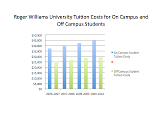
I created my table in excel. I am not very familiar with excel, but I know enough to make a table and be able to graph it.
The table itself is very simple, but I was not able to gather a lot of data. The information only dates back until 2006. Once my table was complete I made multiple graphs in order to determine which graph best displayed the information. Each graph was constructed in excel, and then a title was given in PowerPoint. I copied each graph into a PowerPoint document in order to adjust the size, add a title, and view the graph without the gridded lines excel has.
Sideways Bar Graph
Bar Graph
Line Graph
Pie Chart
3-dimensional Bar Graph
The two graphs that work the best are the Bar Graph and the 3-dimensional Bar Graph. All the variables are the proper x and y axis and the graphs are easy for the audience to read and understand. I'm happy I did this information because I live off campus and it was interesting to do a topic that pertained to my real life.


No comments:
Post a Comment