Monday, December 13, 2010

Final Project

  When we brainstormed ideas we had come up with three different ideas, a chart rating projects and terminology throughout the semester, a storyboard, and a tag cloud.  After mapping out iterations of the projects we agreed that the tag cloud would best represent and fulfill the project requirements.  The tag cloud was the best way we could represent the information we wanted to include in the project.

 (Our Inspiration)

In order to begin the tag cloud we had to figure out which terms, concepts, and projects we wanted to include.  We chose the words based on what we understood as the most beneficial, useful, and informative during the semester.  Color and size differentiate the importance and grouping of each word.  For example, dark green represents maps, maroon represents definitions, blue represents overall concepts, and lime green represents graphs.  Each word was designed with a specific purpose behind it.  For example, we agreed that Gestalt is one of the most important terms from the semester; therefore its size is the largest in the tag cloud.  Additionally, each word is written in all capitals not only to make it visually appealing to the audience, but no to discriminate against any letters. 

Once we made each word, we figured out appropriate placement.  We used a coat hanger as the base of our construction.  Two words were attached to the top of the coat hanger.  Since our placement was already resolved it seemed like it would be easy to attach each word according to the plan.  We used a hole puncher and string to connect the words, but in theory the plan was easier than in practice.  Not every word fits exactly perfectly within each space.  Some of the paper is curled because of where each hole meets on each word.  While the tag cloud is not constructed to absolute perfection, our message is conveyed in a successful manner.  Covering the coat hanger is a picture of a cloud with the words “tag cloud.”  Included in the cloud image is a key which describes our color coded system.  We are very happy with the outcome of the project, despite the minor speed bumps to get here.

(Final Project) 

Persona:
-Emily
-Senior in High School, 17 years old
-Athlete, involved in school newspaper
-Interested in small, liberal arts college
-Enrolled in high school communication class
-Visual Learner
-Interested in communications

Personal Reflection:
The most difficult part of this project seemed to be agreeing on good, solid project idea.  Since the project is very open ended we had trouble narrowing down our thoughts to one idea.  I am very glad with how the project turned out though. 

One of the challenges during the project was the tedious assembly of the tag cloud. In theory the assembly does not seem difficult but it was difficult to attach longer words to shorter words.  The most important thing I learned during this project was planning and communicating are essential.  Without proper communication a project cannot be done and without proper planning a project cannot be made.

Tuesday, December 7, 2010

Multivariate Graph

I was slightly frustrated when I started this project.  I had decided what three variables I wanted to use in my graphs but I could not graph my information the way I wanted to in excel.  I tried various combinations within the table I had created but it was not graphing properly.  I made the decision to hand write my graphs after struggling in excel for quite some time.  I knew that if I graphed my information directly in my sketchbook I had a better chance of conveying my message.

The topic I chose to highlight was my quiz grades during Visual Communications.  The X axis is the grade of each quiz measured in percent.  The Y axis is the time spent on each quiz in minutes.  It was easy to remember how much time I had spent on each quiz.  There were not too many quizzes where I forgot.


The second graph I did was in correlation to the first graph because the X axis variable [from the first graph] was the Y axis variable in the second.  So, the Y axis was the quiz grade and the X axis was the week number.  The relationship I wanted to show was, the more time I spent on a quiz, the higher my grade was.  It should be expected that as the weeks continue my quiz grades did as well.  Usually my grades improve throughout the semester because I learn how the teacher teaches and become familiar with the style of the class.  These quizzes were different though.  Through my graphs it is clear that the week number had no bearing on how well I did, but the amount of time spent on each quiz did.  Since I had the internet and books at my disposal, I always used them for the quizzes.  The one exception to this is when I got a 40% on a quiz in week 9.  I had a lot of work that week and thought it would be a good idea to try a quiz without my tools.  It clearly was not beneficial.


I had a lot of trouble understanding this project initially.  I did not know what exactly I was supposed to do, but I do think I created an effective multivariate graph (at least I hope I did!).

Monday, November 29, 2010

Storyboard

I began this project by looking at the pictures we were required to use.  I wanted to first see if I could make a story in my head before choosing a picture and realizing I had no idea what to write about.


I did the project a little backwards, I chose to do the storyboard using two of the required pictures first.  I chose the 4 boys in green t-shirts playing a sport and the profile shot of the man in a blue hat.  Since I chose the picture with the boys playing a sport [at least that is how I interpreted that picture] I wanted to sport to be soccer, not for any particular reason though.  I re-printed a storyboard sheet so four slides appeared on one piece of paper and used a ruler to draw black lines underneath for the narration.  The first box is a drawing I did of a boy getting a soccer ball kicked into him.  I used the 4 boys lined up next.  My narration displays my storyline.  The third box is the man in the blue hat who I made the father of the boy who got kicked with the soccer ball.  The fourth box shows the crowd of sympathetic parents at the soccer game. 


The picture I chose to use for the other storyboard was the four men walking in what seems to be a windstorm.  For this story I did first person narration.  The second box is a close-up of one of the men in the windstorm who does not have a mask to cover his mouth.  The third box is a close-up of all the men.  The last box is another close-up on a different man.  This story was harder to create since I had to draw 3 pictures instead of 2.  In order for the story to make sense I really concentrated on making the people consistent throughout each box.  I hope the audience is able to distinguish each person.


Not only did I have fun making up stories for pictures, I also learned that consistency and attention to detail are very important in both text and visual books.  I am pleased with how my stories came out because I think are slightly humorous and illustrated to the best of my ability.

Tuesday, November 16, 2010

Simple Table and Graphs

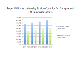
I had trouble beginning this assignment because it was difficult to find information about Roger Williams University.  I tried three different search engines before I came across the information I was looking for.  I chose to have to 3 variables: tuition cost of living on campus, tuition cost of living off campus, and the cost.

I created my table in excel.  I am not very familiar with excel, but I know enough to make a table and be able to graph it.  
  
The table itself is very simple, but I was not able to gather a lot of data.  The information only dates back until 2006.  Once my table was complete I made multiple graphs in order to determine which graph best displayed the information.  Each graph was constructed in excel, and then a title was given in PowerPoint.  I copied each graph into a PowerPoint document in order to adjust the size, add a title, and view the graph without the gridded lines excel has.

Sideways Bar Graph

Bar Graph
Line Graph

Pie Chart


3-dimensional Bar Graph

The two graphs that work the best are the Bar Graph and the 3-dimensional Bar Graph.  All the variables are the proper x and y axis and the graphs are easy for the audience to read and understand.  I'm happy I did this information because I live off campus and it was interesting to do a topic that pertained to my real life.

Tuesday, November 9, 2010

Flow Chart

I was slightly confused by this assignment in the beginning.  I had to carefully plan out my flow chart before designing the actual flow chart.

The first flow chart I did was "ordering the book off amazon."  I began by going to amazon.com and walked through the steps of ordering a book off amazon.  This was very helpful because each step I went through on the website I wrote down on my rough draft what the order is.  My flowchart has multiple decisions/questions in a row.  I am not necessarily sure if that is the right thing to do in a flowchart, but I did not know any other way to organize the steps.  The final product turned out very well.  I was thorough and careful because I did not want to miss any important steps.  My flowchart is easy to read and would help anyone who does not know how to order a book off amazon.
 

The second flowchart was about "researching cognitive load on google."  Again, I went through actual process and wrote down the steps on my rough draft.  This flowchart was shorter than the first one because there were not as many steps involved in this flowchart.  Since this flowchart was shorter I felt that it looked more organized.  The first flowchart had so many steps in it that it looked slightly messy.  This flowchart is not only well researched but aesthetically appealing too.  I was able to make the words larger and be less concerned about the limited space on the page.

Sunday, November 7, 2010

Visual Essay

I had trouble starting this project.  I did not know what graphic to improve because I associated a graphic with a picture.  It was not until I read the suggestions on the Visual Communication web page that I had direction.  I chose to improve a graphic from  Car and Driver magazine, a magazine which I have never read before.  The magazine primarily consists of graphs and charts which compare and contrast different types of vehicles.  I chose a graphic which does just that.


I re-designed my graphic in Adobe InDesign.  I have background knowledge about the program from an electronic communication class I took.  The tools I used within the program were basic though.  I wanted to graphic to be easier to read.  I am not familiar with cars and therefore wanted to make others who do not understand cars able to read a chart comparing various cars more user friendly.

The basic format of he graphic remained the same, I re-ordered some titles in order to clarify certain information, but the information I learned in class about color, size, placement, and typeface were my main areas of focus.  Small, subtle changes make can make a wordy and confusing graphic much easier to read. 

(Original)

The original graphic has odd color usage and inconsistent fonts.

(Rough Drafts)

(Improved Graphic)
Although this project proved to be more challenging than I originally thought it would be, I am very happy with how it turned out.  My graphic is easier to read and more organized.

Monday, November 1, 2010

"How-To" Spaghetti Dinner

I approached this project the same way I did for the in class assignment, "How-To" make a Peanut butter and Jelly sandwich.  I wanted to keep all of my graphics simple so the audience would not be confused.

I first began by breaking the page into four separate sections.  The top line consists of a barilla box of spaghetti and a can of red spaghetti sauce.  The next image, which appears on the same line, is a pot on top of a stove that is filled with water.  Looking back, I wish that I had added one more step in between these.  I should have shown a graphic displaying water being poured into the pot. 


The second lone consists of spaghetti being poured into the pot.  Again, I wish that I had added another step.  I wish that I had somehow figured out how display that the water must come to a boil before spaghetti is poured into the pot.  Next to the pot with spaghetti being poured into it is a clock.  The image next to the pot is of the spaghetti cooking in the pot.  Again, a clock is next to the pot.  The clock reads seven minutes later than the clock to the left of it.  A spaghetti box instructions include a seven minute cooking time.


The third line is the cooked pot of spaghetti being poured into a strainer in a sink.  The next graphic is the spaghetti in the strainer being poured onto a plate.


The final line is an image is the can of sauce being poured onto the spaghetti.  The final image is the plate if spaghetti with sauce on it, a fork and knife, and a glass of wine.


While this project seemed simple at first, it is not easy.  Once I completed my project I found that there were steps I missed.  Since I am so familiar with making spaghetti, I forgot steps that are second nature to me.  I have learned through this assignment and the in class assignment that a pre-graphic should be drawn so the final graphic does not have extraneous information or lack information.

Sunday, October 24, 2010

Tracy Kidder

Tracy Kidder, Pulitzer Prize winner and renowned author, spoke at Roger Williams University about his experiences as a journalist and author.  His most recent nonfiction story, “Mountains Beyond Mountains” was the central topic of discussion. 
The book focuses on two main issues, the global health crises, tuberculosis and AIDS.  Kidder shadowed Dr. Paul Farmer, an ambitious doctor hell bent on establishing clinics and hospitals in Haiti.  The success of his novel has led to traveling throughout the country in order to speak to college students who have read the book as part of the school’s curriculum.
Kidder evokes relaxation and serenity.  He is an approachable professional who was truly encouraging to the Roger Williams students who attended his discussion.  His set-up was atypical for speakers.  He did not lecture; instead chairs were placed in a circle.  Kidder made the situation a welcoming environment.
Aside from talking about “Mountains Beyond Mountains,” Kidder touched upon his life as a writer.  Kidder has written several books and had work published in magazines throughout his lifetime.  He explained that writing a book is an enormous commitment.  Research can almost seem endless; in fact, research is supposedly the fun part.  It is commonly the editor, at least in Kidder’s case, who determines when the research ends and the writing begins. 
Kidder’s writing career began during his sophomore year of college.  He felt strong impulses to continue writing after taking a class focusing on Short Stories/Fiction.  Aside from his intuition, the thought of being his own boss proved to be an appealing perk. 
Kidder seems to be a pretty good boss.  With a Pulitzer Prize under his belt and several successful books, his career is what a writer strives to achieve.  His inspirations for all of his pieces come almost accidently though.  He believes inspiration comes from everywhere and anywhere, but a good writer or journalist must go out into the world and experience things first hand to find a good story. 
“Writing is the only real thinking I do,” Kidder commented.

Wednesday, October 20, 2010

Lawncare Decision Graphic

The first step I did was figuring out how I could represent the necessary words as images.  I began with the Yes and No since they appear the most frequently on the graphic.  I chose to do a thumbs up symbol for yes and thumbs down for no.  At first drawing a thumbs up/thumbs down was no a problem but as I continued the project the drawing got more tedious.  I am still happy with how the thumbs looks though and I do feel that is a universal sign.  The next step was drawing turf grass.  It is difficult to display turf grass in a creative manner aside from a simple bed of grass.  Hopefully the image I created is effective!

There is the large starting image on the left side which then branches off into yes and no(thumbs up/thumbs down).  Since the yes side stops after only one box I chose to use a not allowed sign.  Since stop signs are not necessarily universal I thought that the image I created would be better.  The box on the no side consists of a thermometer with a degrees symbol of 90 degrees or above.  All of the information comes from the paragraph given in class.  Continuing off the thermometer branch is dry grass.  Off of each dry grass branch is a pest in grass, a.k.a. destroying grass.  Choosing a graphic for the pest was the most challenging.  I am not a wonderful artists and therefore had to choose a fairly simple image.  My pest most closely resembles a caterpillar but I still feel as though the image gets the message across.  Branching off the pest in grass is the proper treatment for the turf grass.

At first I did not understand the purpose of the project; it is difficult to think of symbols that will be able to reach the entire world.  For most people, including myself, if a symbol is familiar to you then it is very difficult to imagine it not being familiar to someone else.  Choosing universal symbols was the most challenging step for me, but helped me to think outside of the box.  This project has proved to be very beneficial in order to improve my visual communication skills.   I feel as though if I can create graphics about turf grass I could probably do several different topics.  

Sunday, October 3, 2010

Thursday, September 30, 2010

Geographical Map

I had oddly enough decided to do a geographical map.  Initially I was leaning towards doing a concept map, but decided against it.  I chose a fairly simple geographical location to map because I have never mad a map like this before.  I did not want to broad topic.  I chose to map a small section of Bristol.  My first step was finding map of Bristol that showed a close-up image of the town.  I used the website Mapquest becase the site allows users to type in very specific locations.

I began mapping out the street I live on, State Street.  I made that street name the most prominent because it is the most important street to me.  Despite the map being geographical, I wanted personal touches added to it.  Another location I marked on state street was the restaurant Nacho Mama's.  I love the food there and frequented the restaurant often during the summer. 

My map only extended to the portion of Hope Street in the direction towards the Roger Williams campus.  The other streets included in the map are prominent Bristol streets.  Included in the streets is Hope, Church, High, Wood, Constitution, Union and 1st.  On each street, with exception of Union and Constitution, I put marked a specific place in Bristol.  To find the exact locations of each business or restaurant I searched for their addresses on google and then on mapquest.  It was tedious, but the purpose of a geographical map is accuracy. 

I wanted the map to have a lot of color.  Since geographical maps are often times dull in color, I wanted to do something different.  I really enjoyed this project.  I thought that it would be easier than it was though.  I thought that I new the exact locations of all of the places I chose to highlight but I did not.  This map was completely different than a mind map, but still compeltely useful to further my knowledge about the importance of Visual Communications.

Tuesday, September 28, 2010

Mind Maps

My problem in the center of my mind map is Post-Graduation.  The first mind map I did was very practical.  I was thinking of tangible things such as location, people, and money.  I did have difficulty letting myself think freely.  The 20-minute mapping period went by very slowly.  I took a lot of pauses and time to think instead of just writing.  After waiting an hour, I returned to my map and added a little color to it using colored pencils.  In my mind though, I knew I did not love this map or particularly care for it.  I think that is because I didn't allow myself to fully reflect. 


I returned to the project 24 hours later.  I had the same problem in the center of my mind map, post-graduation.  This time I decided to use a different approach.  My subtopics were from the emotional side of me.  My key terms were Stress, Fear, Change, Strength, and Loneliness.  All of these ideas are abstract an intangible.  My new approach proved to be more successful than my previous mind map.  I was able to think more freely and let my ideas flow naturally.  I got better results from the second mind map than the first, possibly because my concepts were driven by emotion rather than practicality.  I do feel as though mind mapping is a helpful tool for problem solving.  While my problem can't exactly be solved by mean of a mind map, it made me feel less overwhelmed.  I was able to organize my thoughts in some sort of way.  Rather than having all of these thoughts floating around in my head, I wrote them down and now have a firmer grip on my worries.  While I do still have stress about what I will do after graduation, like most seniors do, I know that I should not let my fears get the best of me. 


Monday, May 10, 2010

Final: Narrative


SCRIPT:
 The small town charm of Bristol, Rhode Island is hard to resist.  The open town green is complete with a picturesque white gazebo and small playground for children to enjoy.  Bristol, located half an hour outside of Providence, is a small beach community.  The perimeter of downtown Bristol is edged by beautiful bay views.  Sailboats bob in the water as they overlook the adorable town. 

Along Hope Street, downtowns Main Street, are beautiful homes overlooking Bristol’s calm waters.  Hope Street is home to some of the most historical houses in Bristol, and each street is decorated by scenic colonial style homes.  Each home, although architecturally unique, is banded together in a special and tasteful way.

Driving along High Street, a road parallel to Hope Street, may seem frustrating, but the beauty of Bristol redeems itself for the redundancy of the six stop signs lining the street.
At the end of High Street and the corner of Oliver Street is my home away from home.  I am currently a junior at Roger Williams University and have been fortunate enough to have the opportunity to live off-campus.  I live on the third floor of this three-story home.  Aligning every inch of every street in Bristol are vibrant green trees and sidewalks.

Bristol is home to some unique cuisine.  Amongst my favorites are Leo’s, a delicious but affordable Italian restaurant.  The Wrap Shack, a hole in the wall sandwich shop, it has the most amazing wraps!  Its unique flavors make it one of Bristol’s most tasty and cheap restaurants.  Two amazing and incredibly cheap breakfast spots include the Sunset Café and Manny’s.  Of the two though, Manny’s is the best.  Anywhere that sells a chili cheeseburger for less than $5 is a favorite of mine.  Manny, owner and executive chef is a cynically charming man.  He has a comment for everyone and holds nothing back. 

For something on the go, the delightful Beehive Café offers a relaxing setting and delectable baked goods.  Its tucked away location makes it a favorite of locals.

To say Rhode Islanders love coffee would be an understatement.  In order to satisfy Bristolians coffee cravings there are multiple coffee-spots.  Along Hope Street is the gold-plated Dunking Donuts, a small but quaint spot.  Further down Hope Street on Route 114 is Sip n’ Dip, a Rhode Island favorite.  It’s appropriately placed on the edge of the water.

Downtown Bristol has a variety of stores to satisfy those who love to shop!  Favorites of mine include Striper Moon and Kate and Company.  For those on a budget, Roxie’s consignment fulfills any shopaholics needs. 

A strange but delightful feature of Bristol is the abundance of churches and barbershops. 
It seems as though along every street corner there is a place of worship or a hair salon. 

About two minutes outside of downtown Bristol is Colt State Park.  The beautiful park is frequented by an abundance of Roger Williams University students, myself included.  Upon entering the park, a strong aroma of sea salt and freshly blossomed flowers fills the air.  The long and winding roads seem endless, but in reality only last a few minutes before the water appears.  Seagulls squeak above in the sky while runners run by with their dogs.  Each and every inch of the park offers a variety of luxuries.  On summer days people are often seen grilling hamburgers and hotdogs while enjoying their food at the green picnic tables overlooking the striking view.  If you drive a few minutes past the most popular hang out area, you will find a beautifully weathered willow tree.  It stands alone in a giant open field towards the back entrance of the park.  The willow tree shares its location with a giant old castle, an enticingly haunting structure.  The park itself serves as a personal sanctuary to all Bristol inhabitants.  It untainted preservation makes it one of Bristol’s most charming landmarks.    

Bristol is one of the most spectacular places to live, I feel blessed to have been able to enjoy it for the past three years and look forward to another great year hear. 
  
Design Rationale:
When this assignment was first assigned I thought, what am I passionate about?  There are many things I love.  I love music, food, clothes, the list is endless, but what I really love is Bristol, Rhode Island.  The adorable town which is home to Roger Williams University was one of the main reasons I chose to go to school there.  I had always told my mom that I needed to find my Stars Hollow, the fictional town in the show Gilmore Girls.  


Since freshman year I have loved Roger Williams.  I have made wonderful friends, taken classes I enjoy, and loved living in Bristol.  I had always known that I wanted to live off-campus my junior and senior year, so last year me and two of my friends decided we would make it happen.  I studied abroad in Italy fall semester of this year.  Italy was so amazing and wonderful, but I could not hide my excitement about returning home to live in my apartment on High Street.  


I began this project with my storyboard.  I mapped out what I wanted to take photos of.  Bristol has so many great aspects in it so it was difficult for me to narrow it down to just a few.  My slide show is a bit long, but I did not feel that I could have cut it down anymore than I had.  My next step was going around Bristol and taking pictures of all my favorite spots.  


Once my pictures were taken I edited them in iphoto to enhance them.  I put all of the photos into powerpoint to make a slide show.  


After my PowerPoint was created I wrote a script.  I had so much fun writing the script!  I have GarageBand on my computer so I recorded my voice at home and them opened the sound file on Audacity on the school computers.  Once my voice was in audacity I had to add a background noise that I felt matched the slide show.  Originally I had ocean waves in the background.  They were too loud and did not seem to be the right fit for the slide show.  Instead, I decided to chose a smooth jazz song.  I fits in nicely with the slide show.  The song is not too overpowering, but sets a nice tone underneath my voice.  The jazz clip was 7 minutes long, I only used 4:18 because that is how long my slide show is.  I went through all of the necessary steps in converting the clips from WAV files to MP3 in audacity and iTunes. 


The hard part was over.  Now, I had to convert my PowerPoint presentation to a JPEG and move my MP3 version of my voice over to the desktop.  


I opened up the program SoundSlides and uploaded my PowerPoint slides and sound clip.  I had no trouble doing any of this.  Once the SoundSlides were created I saved the project to the desktop and used the program FileZills to upload the presentation to the web.  This was the first time I had used FileZilla without any problems.  I went to a website which allowed me to upload my website to my blog and my project was complete.


Prior to starting this project I was really excited about it.  It is always fun to work on a project about something you are passionate about.  Since my last project was the BiBi Card, this was a very nice change of pace.  Once the project actually started, my thoughts had changed.  I had some difficulty choosing a background noise and my slide show is not timed perfectly with the voice over.  If I could change anything, I would re-d0 the timing for about 5 pictures.  Overall though, I am happy with how this project came out.  A lot of projects are trial and error and this one was no different.  Had I had more time to complete it I think it would have been perfect.  With each project I have done throughout the semester there has always been something I've wanted to change and this one is no different.


Tuesday, May 4, 2010

Web Brochure


 I have never worked in Dreamweaver before so I was very nervous about this project.  I took a communications class in high school and made a website but that was 4 years ago and if these programs are constantly updated.

To begin this project I opened up 5 blank Dreamweaver documents.  I saved each of the documents under different names; index, contact, about, location, and frequent designers.  I began working on the index document, also called the homepage.  I put a horizontal list of the index, contact, about, and location at the top of each of the 5 documents.  Since I could not remember how to link each page the easy way for each of the 5 titles in the 5 documents I had hand type in where I wanted each title to link to.  At the bottom of Dreamweaver there is a Link box that appears once the title is selected.  For each index I linked it back to the homepage.  For each of the contact I linked it back to the contact page.  I continued to do this for all of the titles.  It seems like it would take a long time, but it went fairly quickly.

Once I completed the navigation portion of the website I typed in the proper information into each document.  The homepage does not have any information.  I attempted to put pictures on my website but had difficulty getting uploading them onto FileZilla.  The information for each link or document, came directly from my brochure.

My final link on my website is a direct link to Anthropologie's official store website.  I simply did the same thing I did for the other links to work.  At the bottom of Dreamweaver I pasted the link to the store's website into the link box. 

After completing the website in Dreamweaver, I had to upload my website onto the internet.  I used the program FileZilla to do this step.  I have used FileZilla before, but I had so much trouble getting my website to work properly.  At first I was typing something wrong, then when I was sure everything was correct, FileZilla would not connet.  I was very frustrated, but evertually I got it to work.  It's always a relief when something you have worked hard to do finally works properly.

If I had more time to complete this project I would have definitely figured out the how to properly post pictures.  Although the only requirements for the project were to make sure the links worked correctly, I do not like the bareness of my website.  I would have loved to use the pictures I thought I uploaded correctly.

I am very happy to have learned how to make a successful website.  It's incredibly cool that I know how to post things on the internet that are active for users. 

Here's a look at My Website!


Monday, May 3, 2010

Bibi Card

I had heard that this project was the most difficult one to comlplete, knowing this, I decided to start work on the BiBi Card well before the due date.

We were to complete the assignment in both QuarkXpress and InDesign.  I am very familiar with Quark because that is the program I have been using for the past few assignments, but I hadn't used InDesign in over a year.  I begain working in Quark since I knew how to use most of the tools anyways.  My first task was trying to figure out what font Esquire used to make their famous title.  I found online that the font is unique to Esquire and I would not be able to reproduce it.  Instead, I took a screen shot of it from online and edited the photo on Photoshop.  This was surprisingly more difficult that I thought it was going to be.  Eventually I got an image I was happy with.  The next step was finding the picture of Daniel Craig that appears on the left side of the BiBi Card.  I found the image fairly quickly on google images but could not access the image without a photobucket account.  I then made a photobucket account searched for the picture on their website.  I was lucky enough to have found any form of the picture but, it was not exactly like the one on the card.  It was slightly narrower, a problem I would later encounter.

Once I found the most difficult pictures I set out to find the right font.  There are three different fonts that appear on the card.  I began looking for the font that appeared the most.  The closest font I could find to the one on the card was Arial Bold.  It is almost a perfect match, the only time that a difference is evident is when I typed out numbers.  The second font I found was Prestige Elite Std.  This font was used for the numbers and letter that appear at the bottom right hand corner of the front.  The third font was cracked, used for the words Best Deal, underneath the subscription prices.

Once the fonts were found I measured each piece of the BiBi Card.  When I was actually reproducing the card I tried my best to get the exact spacing.  I went through the BiBi Card and wrote down next to each word what size font I thought was used.  I didn't always turn out to be right.  After printing my first draft I made adjustments to make sure the fonts on mine and the original matched nearly perfectly.  I began by placing the Esquire title into Quark and choosing the proper size for the title.  I slowly worked my way down the card to complete each line.  For the most part this was not too difficult, the spacing and sizing was tedious though.  A small red arrow appears on above the words Best Deal, I made the arrow in Illustrator.  There was another symbol at the bottom of the card that I could not re-create.  It was a small red mouse.  Once the right side of the card was complete I moved onto the left.

There is a dotted line, a perforation line dividing the left and right side.  I made the line with the line tool and simply changed it from a sold line to a dotted line.  Since the picture of Daniel Craig was not big enough to fit the space without distorting him I decided to place two black boxes next him and center his photo in the middle.  This was a good alternative because my look is still very believable.

Now that the front was complete I attempted to work on the back.  My first step was to turn the Esquire title from black to white.  I did this in Photoshop by inverting the colors.  I made a black box for the smaller right hand side of the card and filled in the few words that there were in a white fill.


The left side of the card was a bit more difficult.  I had to re-work many components of this side before it looked right.  I began by making the postage stamp that appears in the upper right corner.  This was not too difficult, but I did have to change the width of the lines a few time before they were correct.  The next thing I did was to make the text boxes that appeared on the card.  Again, this was not hard, but getting the perfect spacing took a bit of time.  The last part I did was make the bold lines that appear near the perforation line and the ones below the postage.

After completing the Quark BiBi Card I began work on the InDesign one.  I did not know how to do everything in InDesign but I found that this program was actually easier to use than Quark.  The InDesign card went much faster than Quark because I had already done the hard parts in Quark.  


This was a very time consuming project, and one that I am very happy I started well in advance.  Not only did I have the opportunity to work on the project in pieces, time away from it let me get a new perspective.  If I've been looking at the same thing for too long I can't see my mistakes.  I am very happy with how the card turned out, but there are things I would change.  I would have liked to add the mouse to the front of the card and would have liked if the picture was perfect, but there is never enough time to make something completely perfect.

This is the front of the BiBi Card from InDesign:


This is the front of the BiBi Card from InDesign:


This is the front of the BiBi Card from Quark XPress:


This is the back of the BiBi Card from Quark XPress:

Sunday, April 18, 2010

Quark XPress Brochure

 Since I loved using Quark to make my poster, I was very excited about this project.  I was able to choose any corporation, so  I decided to choose my favorite store, Anthropologie.  I have been an avid customer at the store since the opening of one near my house a few years ago.

Anthropologie has a very unique style and I wanted to translate that into a brochure.  I began by choosing a color scheme.  Typically, the store uses more subtle colors that are not too overpowering.  Since it is Spring, I decided to use 4 main colors throughout my project.  The outside of the brochure is a light yellow color that I thought Anthropologie would use for one of their actual designs.  The inside of the brochure is a celery green color that compliments the yellow nicely.  For the font color I chose to use a brown color, it is softer than black, but still dark and easy to read.  The final color I chose to incorporate was a redish, yellow color.  I thought that it tied the font together nicely with some of the colors in the pictures on the inside.

I began by doing the cover of the brochure.  I found the image in google images.  I edited the image in Photoshop to make it smaller.  I knew from the beginning that I wanted to use quotes from the website in the brochure underneath the title of each panel.  To tie the outside with the inside I put a quote underneath the cover image.


The second panel I worked on was the back panel where I chose to list store locations and the history of the store. 

The final panel on the outside was the last panel I worked on.  Originally the panel was white, but because of printing purposes I chose to make it yellow and match the outside panels.  I put the return address that is listed on the Anthropologie website.  I wanted to incorporate the official label of the store so I placed it in the return address.  I used the image of the stamp from google images.

The first panel I did on the inside was clothing.  I decided to highlight dresses and blouses.  All of the images I used on the inside panels were taken directly from the website.  I placed the pictures in the panels and put the price and a small description underneath each picture.  Next to each headline I put some playful words I thought matched the category.


The next panel I did was the accessories.  I highlighted necklaces, earrings, and scarves.  I love their jewelry and really wanted to show off their versatility.  


The last panel on the inside was at home.  I chose to use bedding, kitchen, and bath.  Anthropologie has wonderful house-ware items.  It was incredibly fun to explore the website with no limitations.  Usually I go directly to the sale section of the website, but during this project I used only full-priced items.

I put a lot of effort into this project and I think it shows in my final product.  I loved this project, but it was much more work than I imagined.  It was entirely worth my efforts because I am very proud.

There were some things I would have changed.  I might have used a few less items on the inside panels.  I wanted to show-off as many items I could, but I could not tell if the panels looked too cluttered.  After removing some pictures, I decided that I could not part with any of the pictures which appear in the final brochure.  I wish there was more space in the brochure.  I had a lot of text and it was difficult to fit all of it while keeping it large enough to read.  After my rough-draft was reviewed it was clear that I had to adjust my spacing.  If I didn't, a lot of the text and images would be cut-off.  I made the necessary adjustments and it turned out to be better than it was originally. 

I think the brochure turned out very well and there are not many things I would change if I could re-do it.

Tuesday, April 6, 2010

Soundslide Show


I was apprehensive at first when we were told we had to use Soundslides to publish our powerpoint with music attached(the legal amount of music).  I had never used Soundslides before this project, and anything new is scary.  This was the final component of the band project and I am very proud of how all my components turned out.

To begin this portion of the project I used the program Audacity to edit the music track I chose.  I used roughly 20 seconds of the song, Impossible Germany by Wilco.  I looped the track 3 times so it would complete the required minute for the project.  Once I edited the sound clip in Audacity I brought the clip into iTunes and converted the WAV file into an MP3.  Once the file was converted to an MP3 I  uploaded the sound clip onto Soundslides.  I had a lot of difficulty cutting my audacity clip down to a minute because I had accidentally made a clip that was 1:40 seconds, exceeding the minute by 40 seconds.  I had to re-do the above process several times before I got it right.  I got very frustrated because the computer was not doing what I thought I was telling it to do.  Eventually though, I got it right.

Once the sound clip was edited in Audacity I moved onto the Soudslides portion of the project.  I began by opening up a new project and uploading my slide show presentation which I had converted to a jpeg.  Once the slides were uploaded, I uploaded the sound clip.  Soundslides was very easy to use.  Once every component was uploaded I had to add titles and credits.

This portion of the project was the final component.  I had a lot of trouble with audacity.  My sound clip is not perfect, even though I worked a lot on it.  If I could change a part of my project it would have been aligning the sound clips together better in audacity, but I felt lucky enough to have gotten the sound clip to a minute.  I wish that I had spent more time in the editing process of the sound clip.

I would not change anything else about the project.  I am very proud of this entire project!  Since the beginning of this project I have been enthusiastic about it.

Sunday, April 4, 2010

Quark XPress Poster

When we first got assigned this project I was slightly concerned.  I was nervous to use Quark, I thought, why can't I just use Photoshop?  Now, after using Quark, I am very into it!

I was excited to make a poster for my favorite band.  It's a very fun project.  I also like that the last 3 projects were all connected.  I really enjoyed making the powerpoint and what my final project turned out to be so I wanted to translate the feeling of my powerpoint into a poster.

To begin, I knew I wanted to make use of borders somewhere on the poster.  I also knew that I liked the color combination of a black background and a bright colored font.  I chose yellow, like the one I had used in my powerpoint.  For graphics, I simply did a google search to find the main photograph that would be the highlight of the poster.  Then, knowing I wanted to use a border I decided to outline the large picture with some of the bands album covers, again drawing back to my powerpoint.  Since I had already made each album cover in photoshop for the powerpoint I simply used the same graphics for both.

Making a border did not seem like a difficult task when I was planning, but it turned out to be the most challenging part of the poster.  Each piece used in Quark must be separated into containers.  Therefore, each picture that appears in the border is a separately made box.  Once the boxes were made, I imported the graphics and re-sized each one so they would fit into the container.  Looking at the poster in Quark it seemed that each box was aligned and sized properly.  When I printed the poster everything looked sloppy.  In order to solve this, I was shown how to zoom in on the screen.  I went and re-worked each box so the border was perfect.  The border was very tedious, but worth the result.

Once the main part of the poster was done I filled in the time, location, cost, free giveaway, and date.  I used yellow for the name of the band at the top and the all the details, except for the free giveaway.  I chose to put the free giveaway in a different color because I wanted to highlight the FREE part!  I put it in red, a prominent color that appears in the border.  I felt that it tied the font together with the graphics.

I am very proud of this project!  I feel like after each project I think it's my favorite, but this has definitely been a highlight from the class thus far!

The only thing I wish that I could have changed was the size of the information at the bottom.  I made the font size as large as I could without making it look crowded, but it does not stand out as much as I wish it did.  I am very happy I chose the yellow color, since my font is not too large.

This project has made me excited to do other projects in Quark XPress.


Monday, March 29, 2010

Wilco Powerpoint

When I first got assigned this project I thought, this should be easy.  I am familiar with powerpoint, but through this project I learned that I was not as familiar as I had thought. 

To start this project I had to choose a band.  My favorite band is Wilco.  I have been a fan of there's for years now and have seen them in concert twice.  They have a very peaceful and soothing sound mixed tastefully with a rock n' roll sound.  I did a bit of research on the band before putting the actual slide show together.  I began by doing a basic google searche for some background information on the band which would appear on the second slide.  Then, I researched 4 of my favorite albums from the band for the third and fourth slides.  Once I completed my research I began looking for appropriate pictures for the slide show.  Throughout this class I have learned that editing is key.  Once I find a picture I love, I tend to get very attached to it, but, if I used every photo that I loved my work would look sloppy.  I found  a lot of pictures I liked but chose the ones that I felt were most fluent with one another.

Slide 1:
The first slide is the title slide.  The original photo which appears on the slide was a black and white photo.  I imported the photo into Photoshop and changed the background to a vibrant yellow color, which I later learned is a color that people are instantly attracted to.  The background color I used behind the photo was then carried throughout the project through the font.  I had a lot of black and white photos and the yellow was a great, eye-catching, contrast color.  At the bottom of the slide is a selection of various Wilco posters.  I am a huge fan of borders, a trend I kept consistent throughout the project.


Slide 2:
The second slide provides some background information about the band.  The picture is a shot from outside a venue Wilco played.


Slide 3:
The third slide lists my favorite album, "Sky Blue Sky."  The background picture, another black and white photograph has been layered together with an image of the album cover, "Sky Blue Sky."  Then, along the side is a border of the album cover in its original format.


Slide 4:
The fourth slide compares my 4 favorite albums from the band.  The information is organized into a neat table.


Slide 5:
The final slide is my works cited.  A list of links is listed which tells where I got my information.  At the bottom of the page is a border of the bands album covers.  I imported each album cover into Photoshop and gave them an antique look so they were not as vibrant as the original version.  The background image was also lightened so the links pop better.


I really enjoyed this project, it has been my favorite yet.  I enjoyed researching a band that I love.  It's a great way to get students connected to a project.

If I could have re-done anything I would have changed the layout of my fourth slide.  I would have preferred the information to be horizontal, not vertical.  Also, I would have liked to work on the second slide.  That is the one slide I am unsatisfied with, but I did not know what I wanted to do to change it.

Sunday, March 7, 2010

MyFace is Everywhere


Now, a world without facebook seems like years ago, but facebook was first launched back in 2004 by a sophomore from Harvard University, Mark Zuckerberg.
Initially, the social networking site was known as thefacebook.com, soon after the website gained  popularity the name was shortened to "Facebook." Zuckerman thought to use the name facebook because colleges used to hand out a list of names and pictures to incoming freshman at the beginning of a school year to help students to meet their peers. The term "facebook" has revolutionized into so much more than a pamphlet.

At the beginning of its creation facebook users were required to be members of a college or university. The social network was intended for students to keep in touch with one another via the internet. Dissimilar from its competitors such as, MySpace and Friendster, facebook required students to have a valid email from their university. At the time, there were over 30,000 colleges connected to facebook.

Now, things are different. There are over 400 million facebook users, ranging from tweens to grandparents. Facebook has become an instant success. What started as a social networking tool for college aged students has become completely integrated into society. Everyone has a facebook now. It's not unusual to see parents comments on their child's homepage, in fact, it seems as though it has become more uncommon for a parent not to be a member of facebook.

"There's no buzzkill quite like getting a friend request on Facebook from Mommy and Daddy dearest," as stated in Time Magazines article, "Oh Crap! My Parents Joined Facebook." With so many parents on facebook now it seems as though a child's privacy has completely evaporated, but there are ways to get around a nosy parent with too much time on their hands. The term "blocking" has become a favorite of teens who accept their parents as facebook friends but still want to keep their distance. "Blocking" allows a uses to create a more limited profile from anyone. This way parents and any other "friends" are prevented from seeing something on your hompage or more commonly referred as a profile. As for myself, I do not think I need to worry about either of my parents getting facebook anytime soon. My mother still refers to facebook as "myface" and I will continue to let her call it that.

Facebook is an amazing tool. It lets people keep in touch with one another easily and for free!  People love anything that's free and anything. Facebook is not only used as a way to keep in touch with friends and families but as a way to make new friends and meet new people. Facebook can be very addicting though. 50% of active users log on to Facebook in any given day and more than 35 million users update their status each day. A status appears at the top of someone's profile. It's usually listed above the persons name. People typically list what their plans are for the day, if anything exciting happens, a funny quote, a song lyric, or anything that anyone thinks that people find remotely interesting.

Facebook has become so popular that if a college student does not have one, that is unusual. Many people use facebook to "stalk" people. Many college students have well over 500 "friends," but how many of those people are actually friends with those people. The dictionary definition of a friend is, "A person whom one knows and with whom one has a bond of mutual affection, typically exclusive of sexual or family relations.

Now, take a look at your facebook homepage. At the bottom left hand corner a list of 6 randomly selected people are chosen. How many of those 6 people do you talk to on a regular basis? For me, 0/6.

Facebook has become less of a way to stay in touch with people you have close relationships with and more of a "stalking" tool. People can find out anything about almost anyone on facebook. When you really think about what facebook has become it seems rather creepy and extremely invasive, but still there are so many users. I'm not any different though. If I can I log into facebook everyday. I do use it as a way to keep in touch with friends, and a way to stalk, and to procrastinate. If I have a lot of homework on the computer I take very regular breaks just to peruse facebook. It's addicting and immensely popular and will not be going anywhere for a long time.

Within the past few years facebook is not only being used by students and parents, but also employers. More and more employers are using social networking sites to screen job candidates. 45% of employers use facebook to screen job candidates. If facebook users aren't careful about what they post on the internet, they could lose out on potential job opportunities because of inappropriate pictures or illegal activities:
*Candidate posted provocative or inappropriate photographs or information - 53%
*Candidate posted content about them drinking or using drugs - 44%

Students looking to find jobs post-graduation must be careful about what they keep private and what they publicize. Facebook can turn on you.

I have now had facebook for 3 years. I use it a lot for many different things. Not only to keep in touch with people, but for events, on campus activites, and clubs and organizations school wide. It is an extremely useful tool since almost everyone has a facebook, but the downsides of facebook are real. People should not think they are immune to the negative effects facebook can have on one's life.


*Links*
*http://mashable.com/2006/08/25/facebook-profile/
*http://personalweb.about.com/od/makefriendsonfacebook/a/whatisfacebook_5.htm
*http://www.facebook.com/press/info.php?statistics
*http://www.time.com/time/business/article/0,8599,1909187,00.html
*http://oregonbusinessreport.com/2009/08/45-employers-use-facebook-twitter-to-screen-job-candidates/